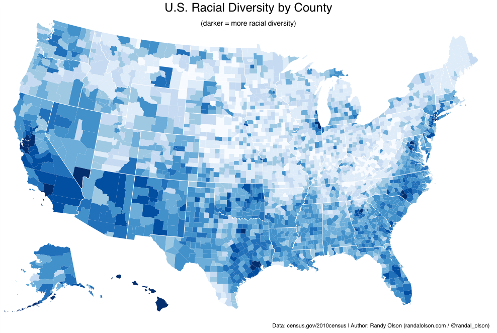
Jeffrey Chen, a fellow Presidential Innovation Fellow, R expert, and all-round amazing human being, took a few hours out of his spare time and created a cool visualization of the diversity data of the CENSUS.
Is anyone surprised that?

Yes, I am aware that the Census has an interactive map.
However, this very focused visualization tells a specific story and highlights what most are afraid to confront. What is your take on the data? 
0 Comments
Leave a Reply. |
Dr Tyrone Grandison
Executive. Technologist. Change Agent. Computer Scientist. Data Nerd. Privacy and Security Geek. Archives
May 2018
Categories |

 RSS Feed

|